X Bar R Control Charts

X Bar R charts are the widely used control charts for variable data to examine the process stability in many industries (like hospital patients’ blood pressure over time, customer call handle times, length of a part in a production process, etc).
Selection of the appropriate control chart is very important in control chart mapping; otherwise, you will end up with inaccurate control limits for the data.
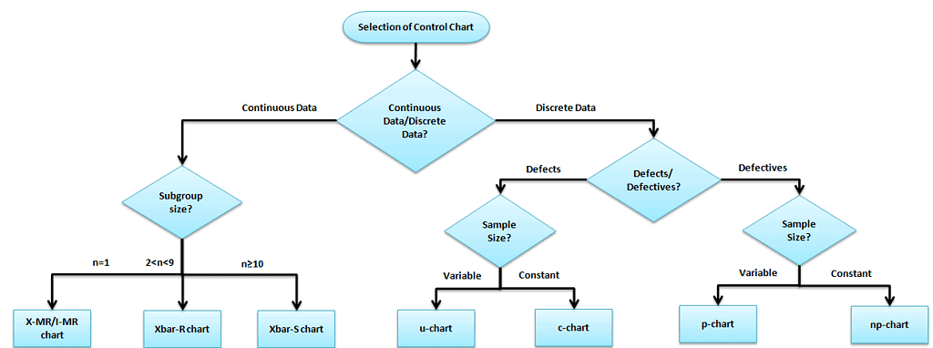
X bar R chart is used to monitor the process performance of continuous data. You can also use them to collect data from subgroups at set time periods. It is actually two plots to monitor the process mean and the process variation over time and is an example of statistical process control. These combination charts help to understand the stability of processes and detect special cause variation.
The cumulative sum (CUSUM) and the exponentially weighted moving average (EWMA) charts also monitor the mean of the process, but the basic difference is unlike the X bar chart. They consider the previous value means at each point.
Don’t like Ads? Neither do I. If you’re a member, just log in to avoid ads. If you’re not a member, what are you waiting for? Sign up here!
X Bar R Control Chart Definitions
X bar chart: The mean or average change in a process over time from subgroup values. The control limits on the X bar consider the sample’s mean and center.
R chart: The range of the process over time from subgroup values. This monitors the spread of the process over time.
Use X Bar R Control Charts When:
- Even a very stable process may have some minor variations, which will cause the process instability. An X-bar R chart will help to identify the process variation over time.
- When the data is assumed to be normally distributed.
- An X bar R chart is for a subgroup size of more than one (for an I-MR chart the subgroup size is one only), and generally, it is used when rationally collecting measurements in a subgroup size between two and ten observations.
- The X Bar S Control chart is to be considered when the subgroup size is more than 10.
- When the collected data is continuous (i.e., Length, Weight), etc., and captures data in time order.
How to Interpret the X Bar R Control Charts
- To correctly interpret an X-bar R chart, always examine the R chart first.
- The X bar chart controls limits that are derived from the R bar (average range) values. If the R chart’s values are out of control, the X bar chart control limits are inaccurate.
- If the points are out of control in the R chart, then stop the process. Identify the special cause and address the issue. Remove those subgroups from the calculations.
- Once the R bar chart is in control, then review the X bar chart and interpret the points against the control limits.
- All the points need to be interpreted against the control limits but not specification limits. As the customer or management provides specification limits, whereas control limits are derived from the average and range values of the subgroups.
- Process capability studies can only be performed after the X bar and R chart values are within the control limits. There is no need to perform process capability studies for an unstable process.
Steps to follow for X bar R chart
The objective of the chart and subgroup size
- Determine the objective of the chart and choose the important variables
- Choose the appropriate subgroup size and the sampling frequency
- Collect a minimum of 20 to 25 sets of samples in the time sequence
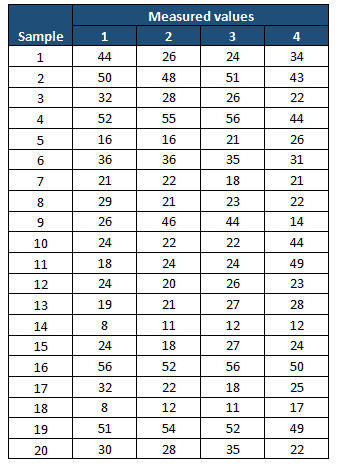
Example: In the manufacturing industry, plate thickness is one of the important CTQ factors. During the Measure phase, the project team performed the process capability study and identified that the process was not capable (less than 2 sigmas). In the Analyze phase, they collected 20 sets of plate thickness samples with a subgroup size of 4.
Compute X bar and R values
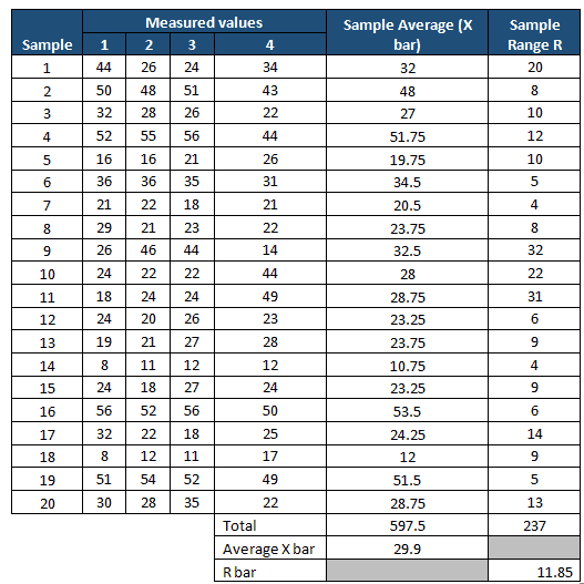
- Measure the average of each subgroup i.e., X-bar, then compute the grand average of all X-bar values. This will be the center line for the X-bar chart.
- Compute the range of each subgroup i.e. Range, then measure grand averages of all range values i.e., R bar, and this will be the center line for the R chart.
Determine the Control Limits
- The first set of subgroups determines the process mean and standard deviation. These values are to be considered for creating control limits for both ranges and the mean of each subgroup.
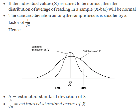
- The process is to be in control in the early phase of production. You must identify any special causes if any of the points are out of control during the initial phase. Also, you should remove the subgroup before the calculation.
- Sometimes, having a few points out of control on the x-bar portion would also be good in the initial phase. Otherwise, if all the values are within the control limits, it may be because of the slop in the measurement system, and the team won’t focus on it. Identify the appropriate Measurement System Evaluation (MSE).
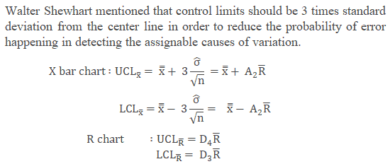
- Where
- X is the individual value (data)
- n is the sample size (subgroup size)
- X bar is the average reading in a sample
- R is the Range, in other words, the difference between the largest and smallest value in each sample.
- R-bar is the average of all the ranges.
- UCL is the Upper control limit
- LCL is the Lower control limit
Don’t like Ads? Neither do I. If you’re a member, just log in to avoid ads. If you’re not a member, what are you waiting for? Sign up here!
The below control chart constants are the approximate values used to measure the control limits for the X-bar R chart and other control charts based on subgroup size.
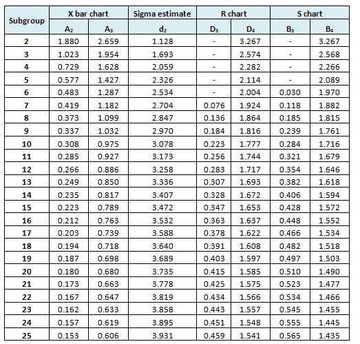
Refer to common factors for various control charts.
Example cont: In the above example n=4


Interpret X bar and R chart
Example Cont: Use the above values and plot the X bar and Range chart

From both the X-bar and R charts, it is clearly evident that most of the values are out of control; hence the process is not stable.
Monitor the process after improvement
- Once the process stabilizes and control limits are in place, monitor the process performance over a set time period.
Example cont: Control Phase – Once the process is improved and matured, the team identifies the X bar R chart as one of the control methods in the Control plan, which is used to monitor the process performance over time.
The following are the measurement values in the Control phase of the project.
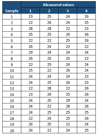
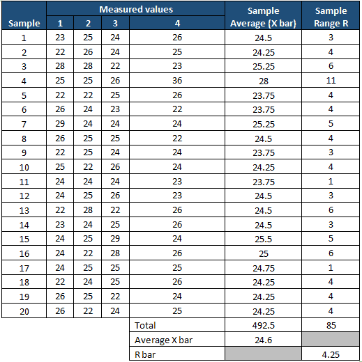
Compute X-bar and Range
 Don’t like Ads? Neither do I. If you’re a member, just log in to avoid ads. If you’re not a member, what are you waiting for? Sign up here!
From both the X-bar and R charts, it is clearly evident that the process is almost stable. During the initial phase, one value is out of control. The team has to perform a root cause analysis for the special cause. It also seems that the process is smoothing out from the data set number 16. If that continued, the chart would need new control limits from that point.
- After the process is stabilized, even if any point goes out of the control limits, it indicates an assignable cause exists in the process that needs to be addressed. This is an ongoing process to monitor the process performance.
https://www.youtube.com/watch?v=djEMQLS7VCc
Important notes
- A process that is “in control” means that the process is stable and it is predictable.
- Just because a process is stable does not mean it has a zero-defect process.
- Remember to NEVER put specifications on any kind of control chart.
- The points on the chart are comprised of averages, not individuals. Specification limits are based on individuals, not averages.
- The operator might have the tendency to not react to a point that is out of control when the point is within the specification limits.
- X bar R chart helps to avoid unnecessary adjustments in the process.
X Bar R Control Chart Videos
Authors
I originally created SixSigmaStudyGuide.com to help me prepare for my own Black belt exams. Overtime I've grown the site to help tens of thousands of Six Sigma belt candidates prepare for their Green Belt & Black Belt exams. Go here to learn how to pass your Six Sigma exam the 1st time through! View all posts


 Don’t like Ads? Neither do I. If you’re a member, just log in to avoid ads. If you’re not a member, what are you waiting for? Sign up here!